
Use case
Edit Menu Photos with AI
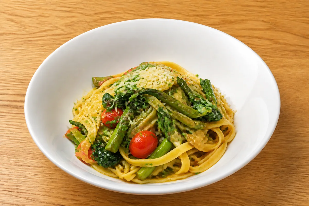
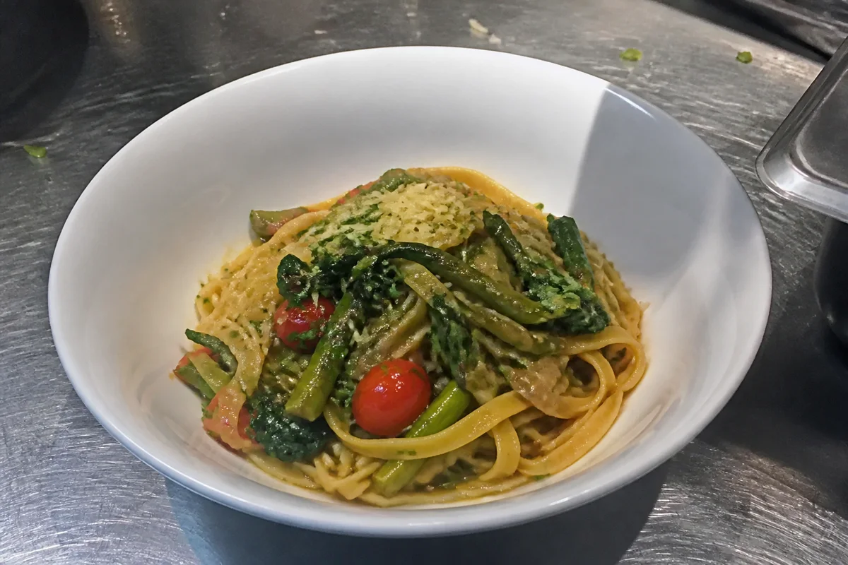
The workflow in action — drag to compare.
A photo menu lives or dies on consistency. Diners forgive one imperfect photo; they don't forgive a menu where each dish was clearly shot on a different day, in different light, on a different table — it reads as carelessness before they've tasted anything. Printed menus raise the stakes: color errors and low resolution get magnified on paper.
AI editing makes a consistent menu achievable from ordinary kitchen photos. Give every dish the same clean background treatment, correct color so each plate looks accurate and appetizing side by side, and upscale everything to print resolution so the laminated menu and the lightbox board stay sharp.
The same edited set feeds every format — printed menus, wall boards, QR digital menus, and delivery-app listings — so the food looks like the same restaurant everywhere it appears.
The problems this solves
- Dishes photographed on different days look mismatched side by side on the menu.
- Backgrounds vary from stainless steel to tablecloth to cutting board across items.
- Printed menus expose low resolution and off colors that a phone screen hid.
- The menu board, print menu, QR menu, and delivery apps all need different image shapes.
A workflow that works
Cut each dish out of its original setting
Isolating each plate removes the mismatched tables and counters that make menu photo grids look chaotic.
AI Background RemoverPlace dishes on one consistent background
A single background treatment — clean white, warm wood, or dark slate — instantly makes the whole menu look designed.
AI Background ChangerMatch color across the whole set
When photos sit in a grid, color inconsistency is glaring; correction gets every dish to the same accurate, appetizing baseline.
AI Color CorrectionUpscale for print and boards
Menu boards and printed menus need much more resolution than delivery-app thumbnails; upscaling covers the largest format you'll use.
AI Image UpscalerCrop each format from the master
Square for delivery apps, wide for menu boards, and whatever the print layout calls for — all from one edited master per dish.
AI Photo ReframeFrequently asked questions
What's the best background for menu photos?
One that fits your brand and stays identical across dishes: clean white or light neutral for a bright fast-casual look, dark slate or wood for an upscale feel. The specific choice matters less than using it for every single item.
What resolution do printed menus need?
300 DPI at printed size — a 3-inch photo on the menu needs about 900x900 pixels, and a menu-board hero shot needs several thousand pixels wide. Upscale your masters once and downsize per placement.
Should every menu item have a photo?
Photo-heavy menus suit fast-casual and delivery contexts; upscale restaurants often photograph only signatures. Whatever you choose, every photo you do include should meet the same quality bar — one bad photo hurts more than a missing one.
How often should menu photos be updated?
Whenever the plating or recipe visibly changes, and seasonally if your menu rotates. Keeping the same background and editing recipe means new photos drop into the existing set without redoing everything.
Related use cases